
This article will explain how you can configure some graphs for your summary reports. We're using the example of the job cost by category report for this tutorial. Here is a guide on how to create a job summary report.
First, open the report by going to Reporting > Pre-configured reports > Job cost by category
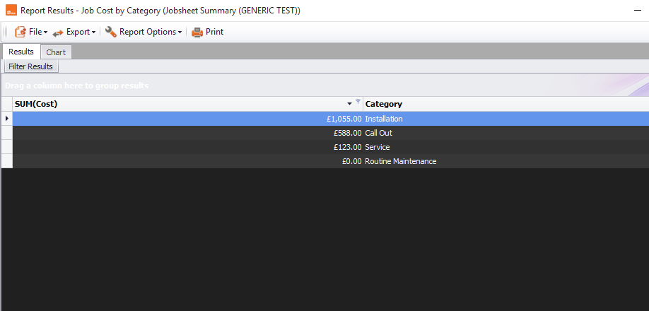
You will see something similar to the below screenshot, with a list of your job categories.
Click the 'Chart' tab and you will see something similar to the below.
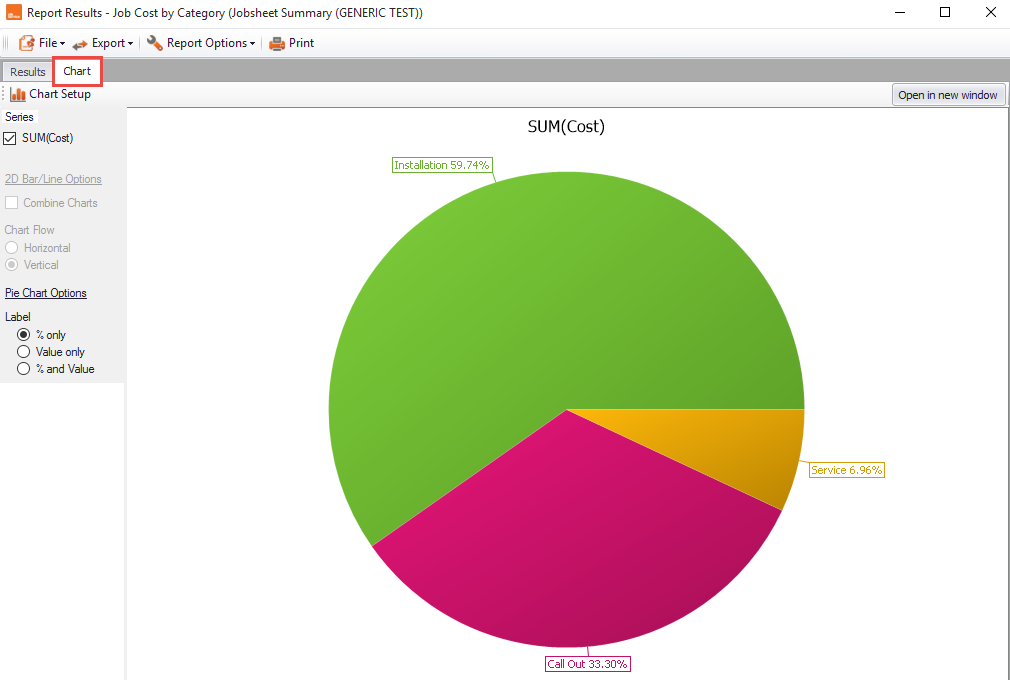
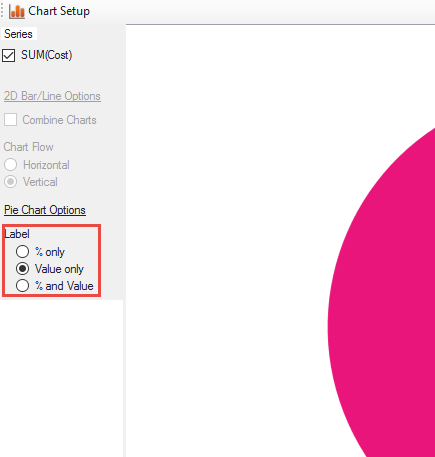
As you can see, the chart is showing the percentage at the moment, but you can change this by selecting 'Value Only' or '% and value' under the 'Label' option on the left-hand side.
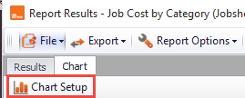
If you would prefer to change the chart type to a bar chart, for example, click on 'Chart Setup'.
Once in the chart setup, you can change the appearance of your chart. For example, here we selected bar chart as the chart type.
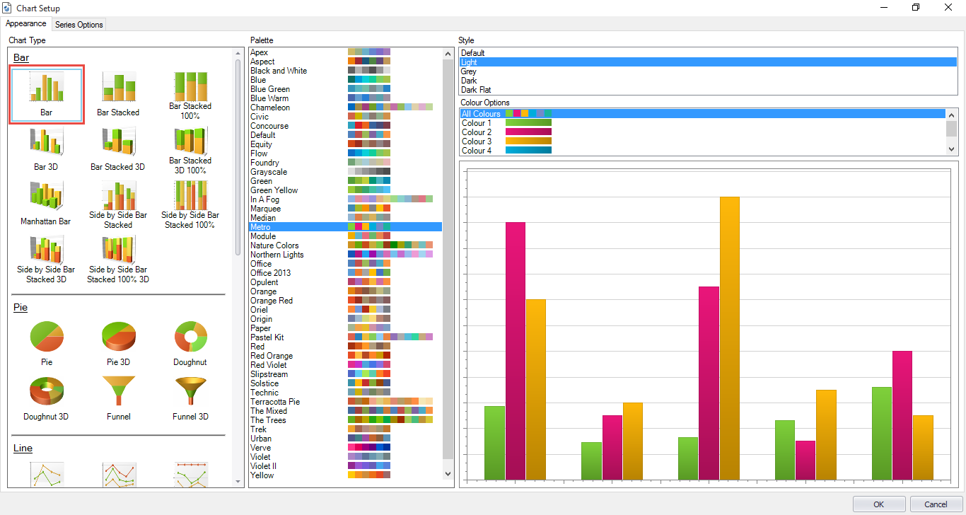
You can also change the colours of your chart with the 'Palette' tab.
There is also a 'Style' tab, which allows you to change the default theme of your graph.
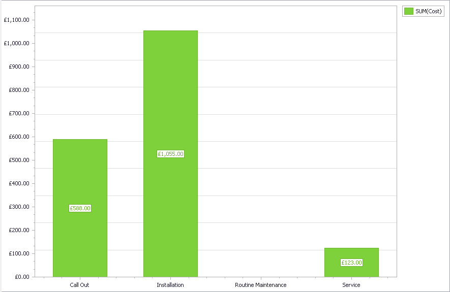
Once you’re happy, click 'OK' and you've configured your graph.
Comments
0 comments
Article is closed for comments.